WPF基础容器与布局
WPF的xaml中进行布局设定时,少不了和布局容器打交道,合理的使用和搭配这些容器,能够让页面美观的同时,可维护性和可拓展性更高
布局容器(面板控件)
容器中的控件(子元素)理论上是建议不显式指定尺寸,不使用屏幕坐标设定控件自身的位置
常见容器如下:
| 控件名称 | 用途 |
|---|---|
| DockPanel | 子级元素依靠在容器边缘,分为 顶部、底部、左侧、右侧,用于实现靠近边缘的工具栏、表单提交按钮等布局,通过在子元素中使用附加属性DockPanel.Dock进行控制,同时需要注意是否需要考虑设定LastChildFill控制容器的最后一个元素是否填充剩余空间,顶部和底部优先级高于左侧和右侧 |
| WrapPanel | 将每个子元素水平(默认)或垂直方向定位到另一个子元素的旁边,水平或垂直方向不满足当前元素的宽度或者高度时,元素自动换行或换列 |
| StackPanel | 子元素在某一方向(水平/垂直)相互之间有序靠近,子元素控件的高度或宽度决定了子元素的填充范围,操作子元素自身并不会换行或者换列 |
| Grid | 自带面板中最复杂的,网格布局风格,通过设定行列数以及Grid.Column、Row以及跨行跨列数附加型依赖属性,能够灵活的控制子元素的布局,几乎能够实现其他常用布局容器的大部分功能 |
| UniformGrid | 等比网格,比起grid使用上更简单,不需要为子元素设定位子,相邻元素一次排列,通过显式或者默认的行列数量,决定行列均匀分布的网格布局 |
| Canvas | 不会默认做任何事,而是允许你把控件放在它的内部,然后显式地给这些控件定位,用于绘制图案,作为画布使用,同时内部控件使用相对位置定位,Canvas.Top、Canvas.Left、Canvas.Right、Canvas.Bottom控制子元素的位置,其中Z轴决定多个图层间的上下层排列顺序 |
| InkCanvas | 手写板,用于进行三方笔触手写,不同模式拥有不同的手写或者操作功能,能够实现粘贴复制等功能 |
容器嵌套
各个容器的特性不同,可以通过各个容器的组合实现符合业务需求的页面布局效果,例如一个上下结构的页面,效果如下:

xaml代码如下:
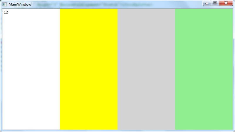
1 | <DockPanel> |
网格拆分器
GridSplitter能够允许用户手动Grid调整单元格行或者列的尺寸大小
1 | <Grid> |
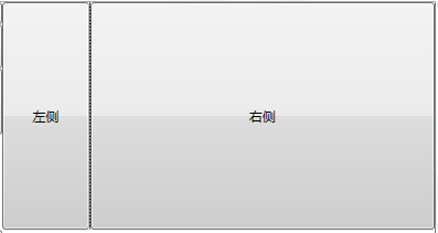
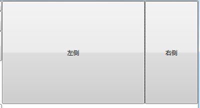
其中的ResizeDirection 属性可以设定分割器的行列模式
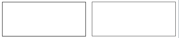
布局舍入
UseLayoutRounding属性设置为True时,能够对布局中的显示部分进行尺寸舍入,保证控件的清晰度
案例:
1 | <Border BorderThickness="1.4" BorderBrush="Black" Margin="10"></Border> |
效果:
自定义布局容器
通过查看微软文档知道,容器的父类为Panel类型如下:
Panel
派生
System.Windows.Controls.Canvas
System.Windows.Controls.DockPanel
System.Windows.Controls.Grid
System.Windows.Controls.StackPanel
System.Windows.Controls.VirtualizingPanel
System.Windows.Controls.WrapPanel
System.Windows.Controls.Primitives.TabPanel
System.Windows.Controls.Primitives.ToolBarOverflowPanel
System.Windows.Controls.Primitives.UniformGrid
System.Windows.Controls.Ribbon.Primitives.RibbonContextualTabGroupsPanel
System.Windows.Controls.Ribbon.Primitives.RibbonGalleryCategoriesPanel
System.Windows.Controls.Ribbon.Primitives.RibbonGalleryItemsPanel
System.Windows.Controls.Ribbon.Primitives.RibbonGroupItemsPanel
System.Windows.Controls.Ribbon.Primitives.RibbonQuickAccessToolBarOverflowPanel
System.Windows.Controls.Ribbon.Primitives.RibbonTabHeadersPanel
System.Windows.Controls.Ribbon.Primitives.RibbonTabsPanel
System.Windows.Controls.Ribbon.Primitives.RibbonTitlePanel
通过了解Panel-.Net 4.8、Panel-core3.1类相关的函数
正如文档所说:
WPF provides a comprehensive suite of derived Panel implementations, enabling many complex layouts. If you want to implement new layout containers, use the MeasureOverride and ArrangeOverride methods. For a demonstration of how to use these methods, see Create a Custom Content-Wrapping Panel Sample.
WPF提供了一套全面的Panel派生实现, 从而实现了很多复杂的布局。 如果要实现新的MeasureOverride布局容器, 请使用和ArrangeOverride方法。 有关如何使用这些方法的演示, 请参阅创建自定义内容换行面板示例。(来源于微软文档)
也就是说,构建自己的容器可以继承Panel,重写函数MeasureOverride和ArrangeOverride实现,MeasureOverride函数用于测量子元素期望的布局尺寸,ArrangeOverride函数用于设定子元素在容器中的位置和布局大小,那么开始自定义容器之旅吧!
简单实现一个自定义Panel,容器内的元素水平均分布局:
自定义MarkPanel.cs
1 | [System.Windows.Localizability(System.Windows.LocalizationCategory.Ignore)] |
在xaml引用对应自定义所在的命名空间:
1 | xmlns:local="clr-namespace:Blog.CasePanel" |
xaml:
1 | <local:MakerPanel> |
效果: